

Squizzi
Brand identity, packaging and ecommerce site
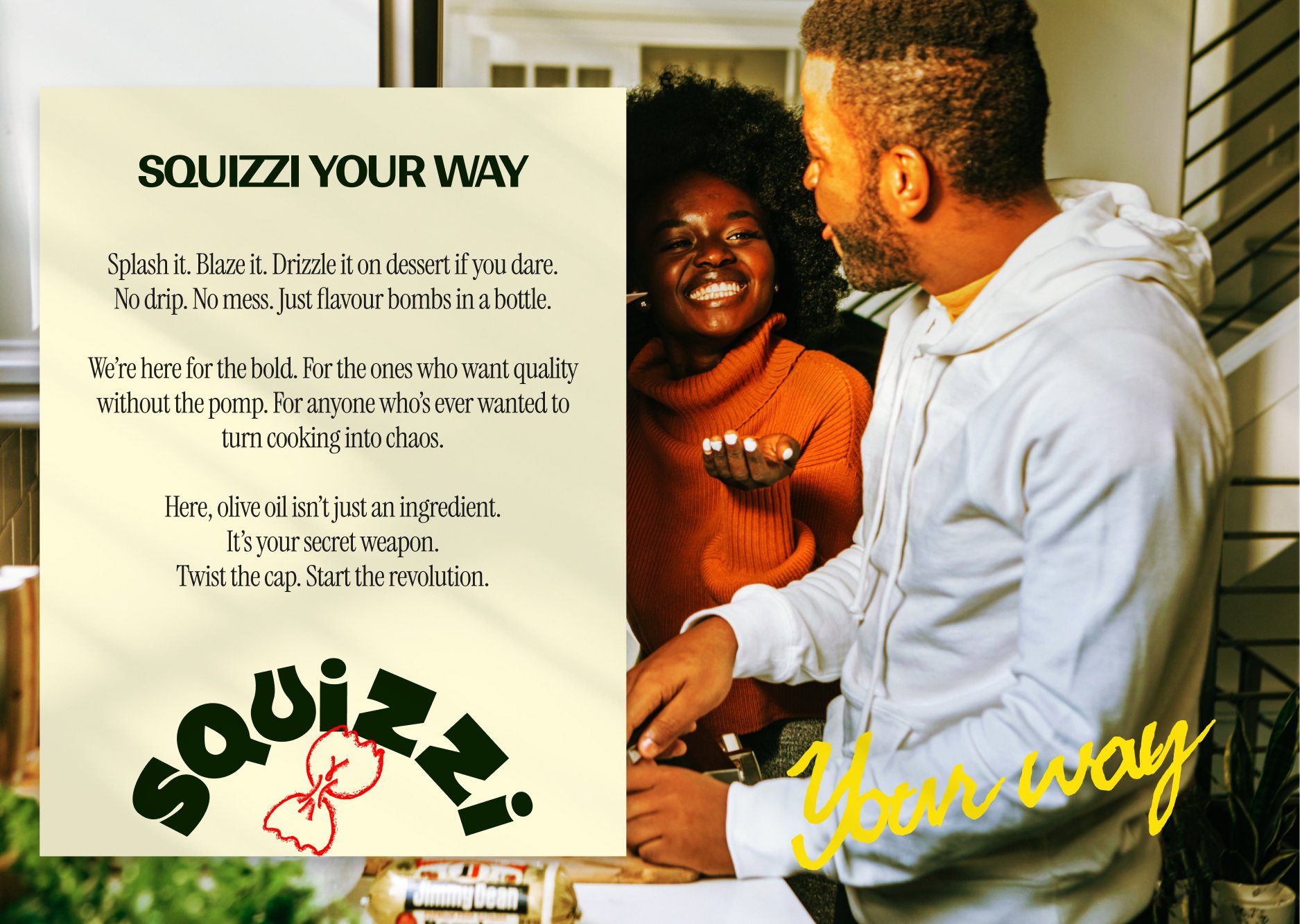
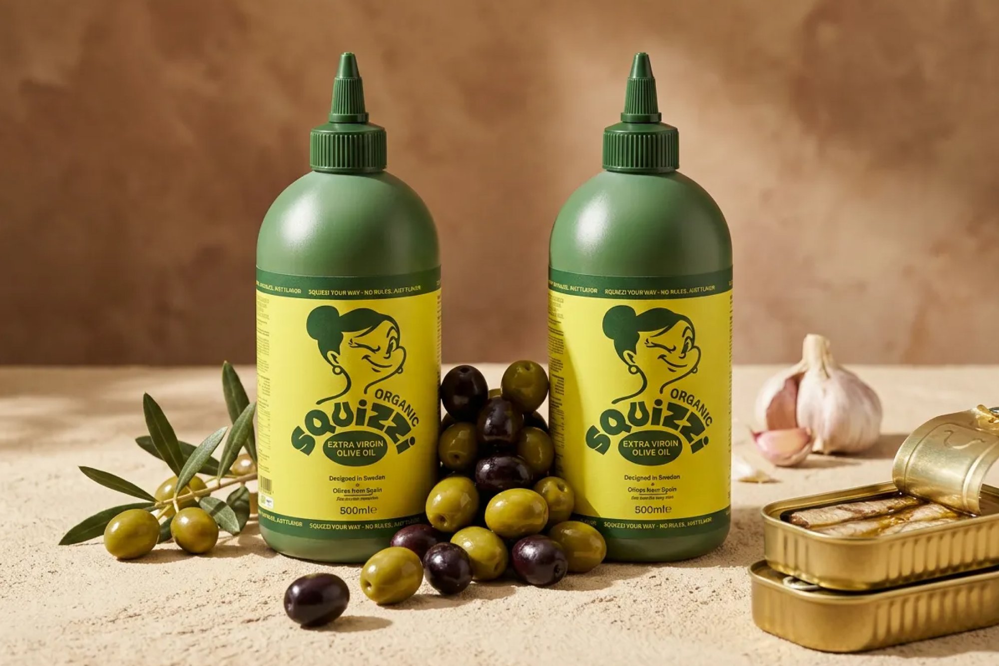
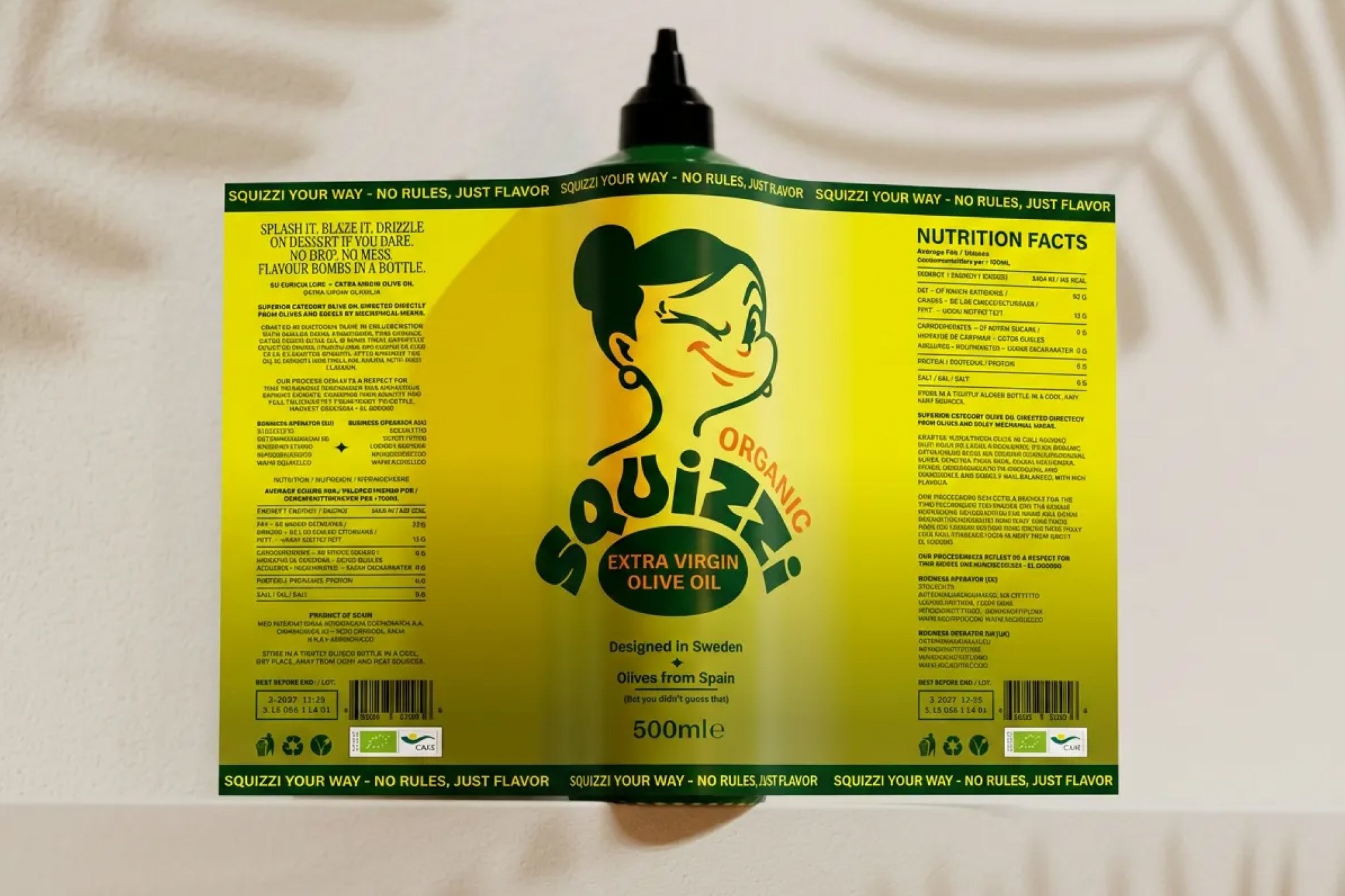
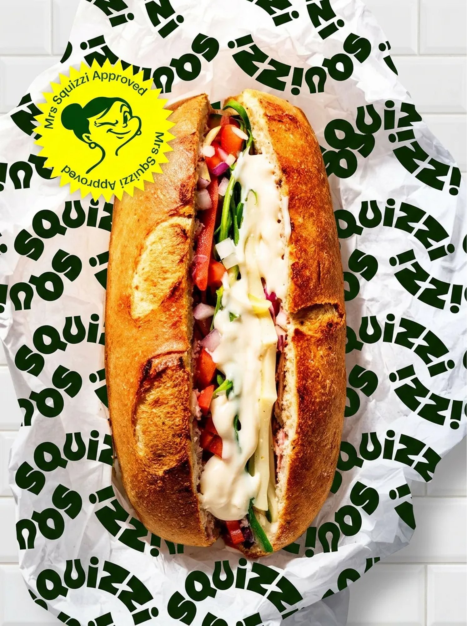
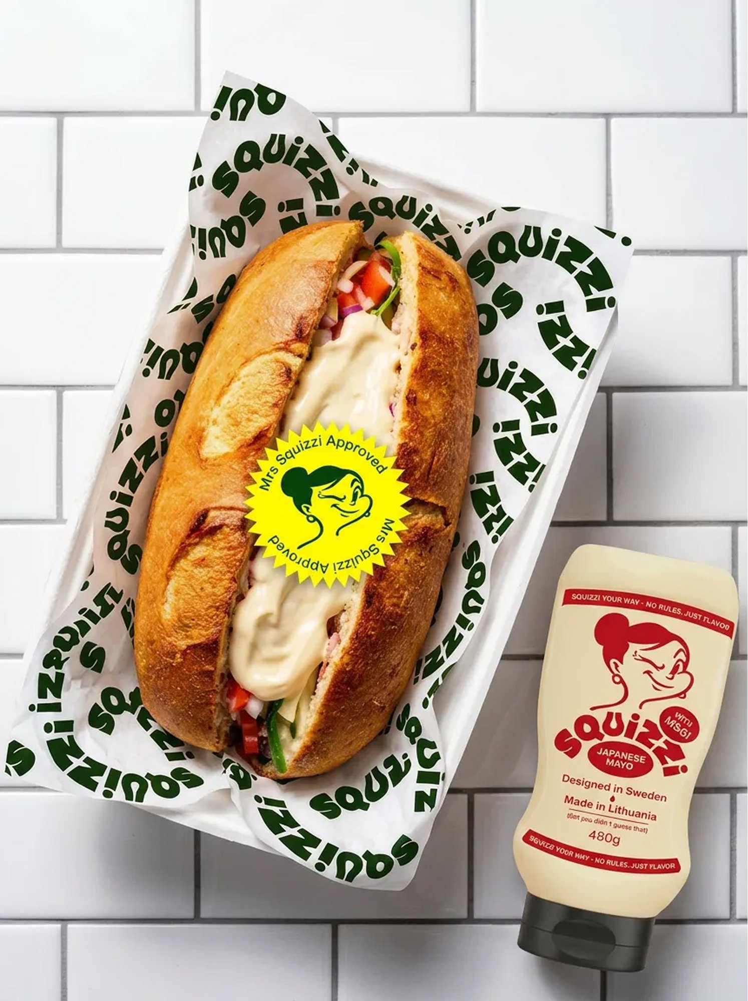
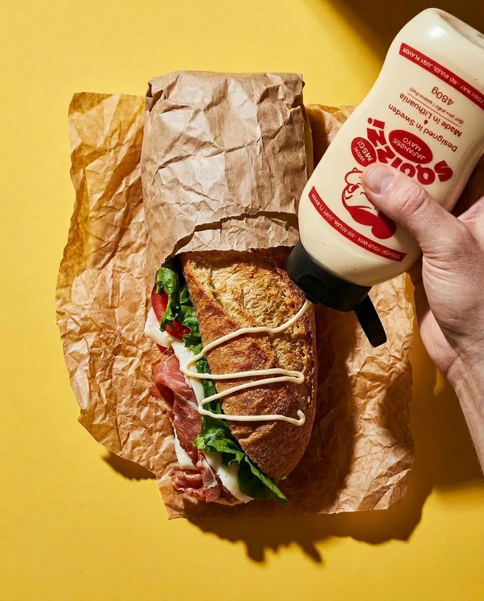
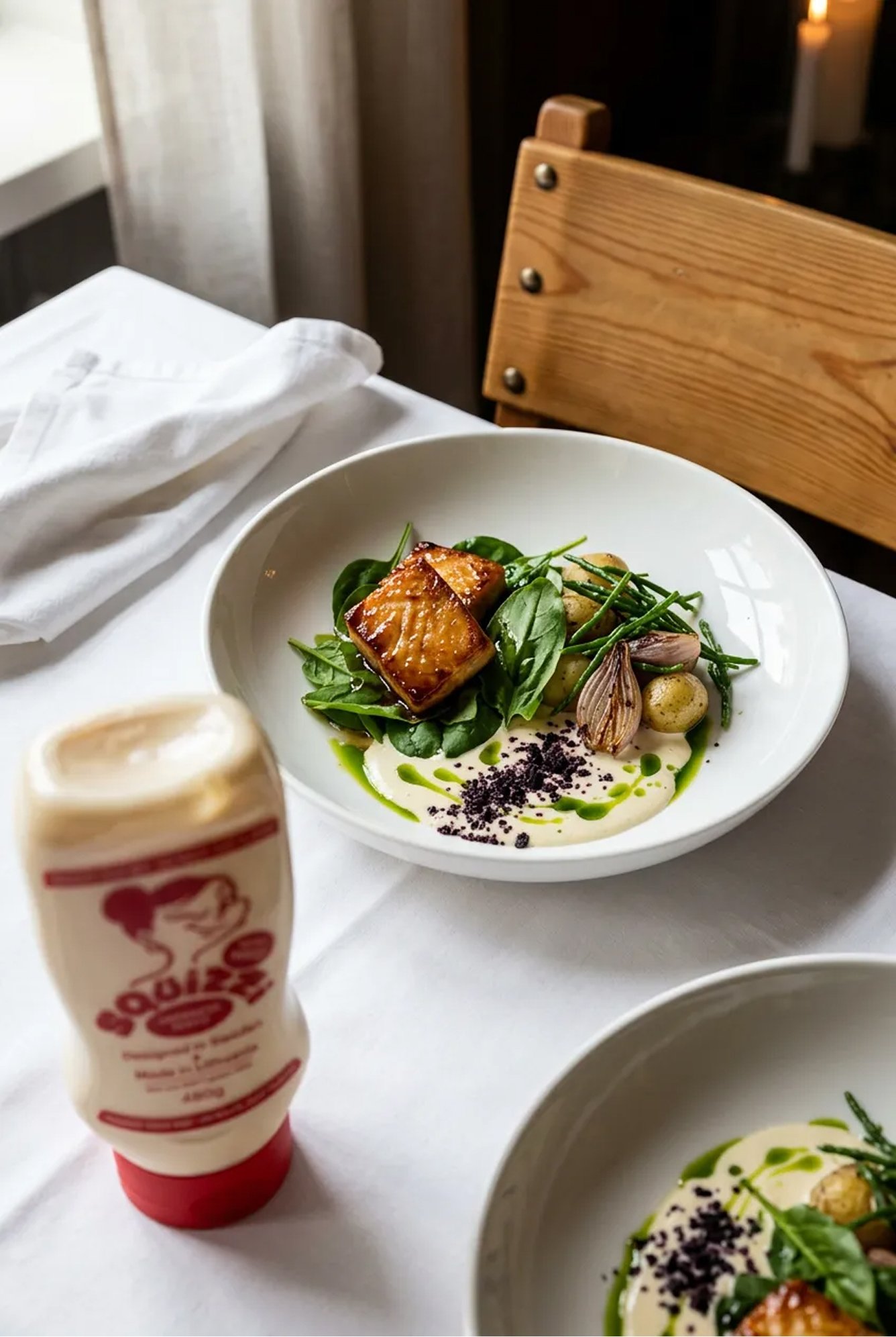
I designed the brand identity, illustration system, packaging, and ecommerce site for Squizzi — a playful Italian-at-heart, Swedish-designed condement brand built around its rebellious heroine, Mrs Squizzi.
Collaboration
- Philip Mikal
- Edward Basse
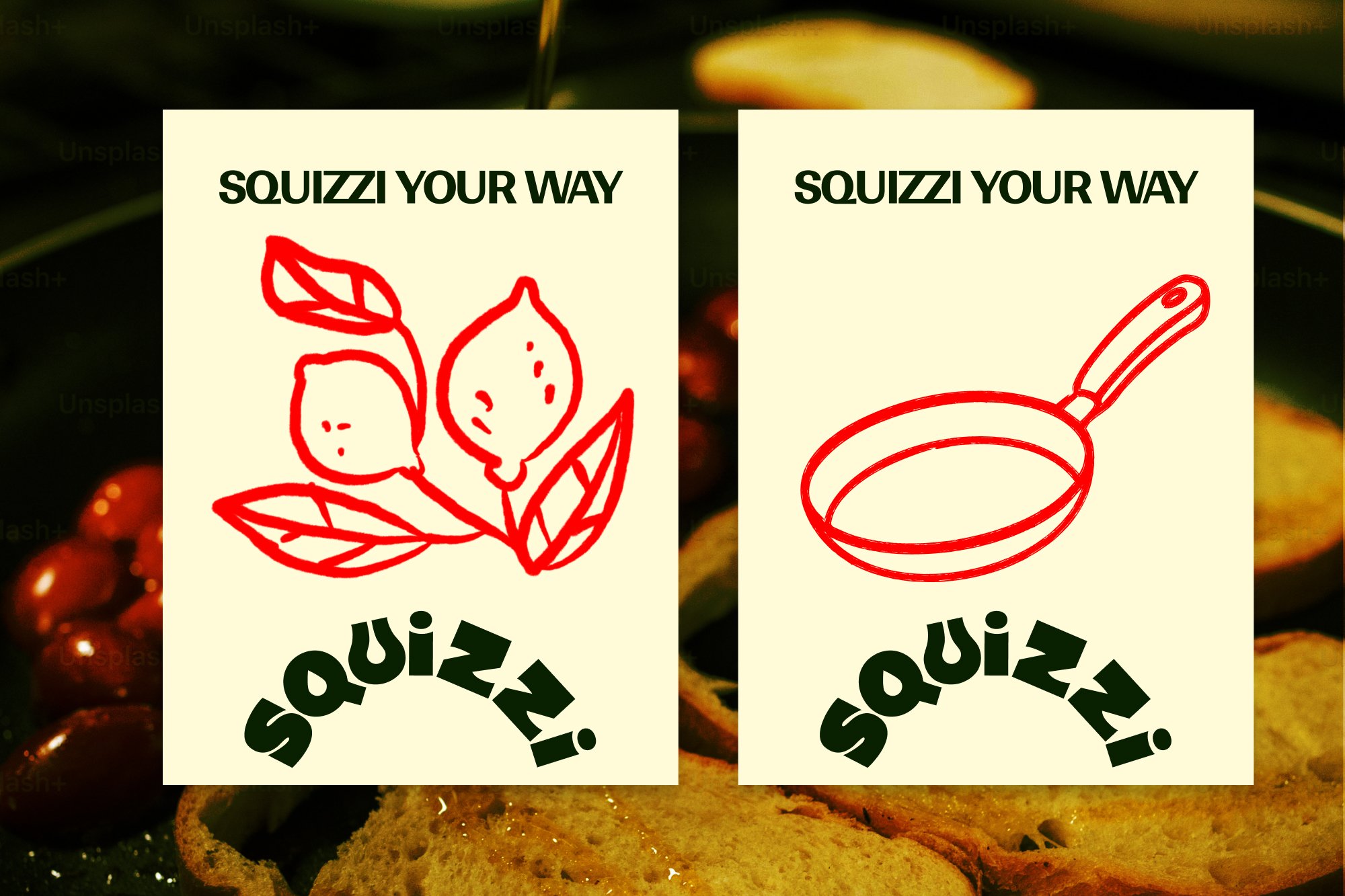
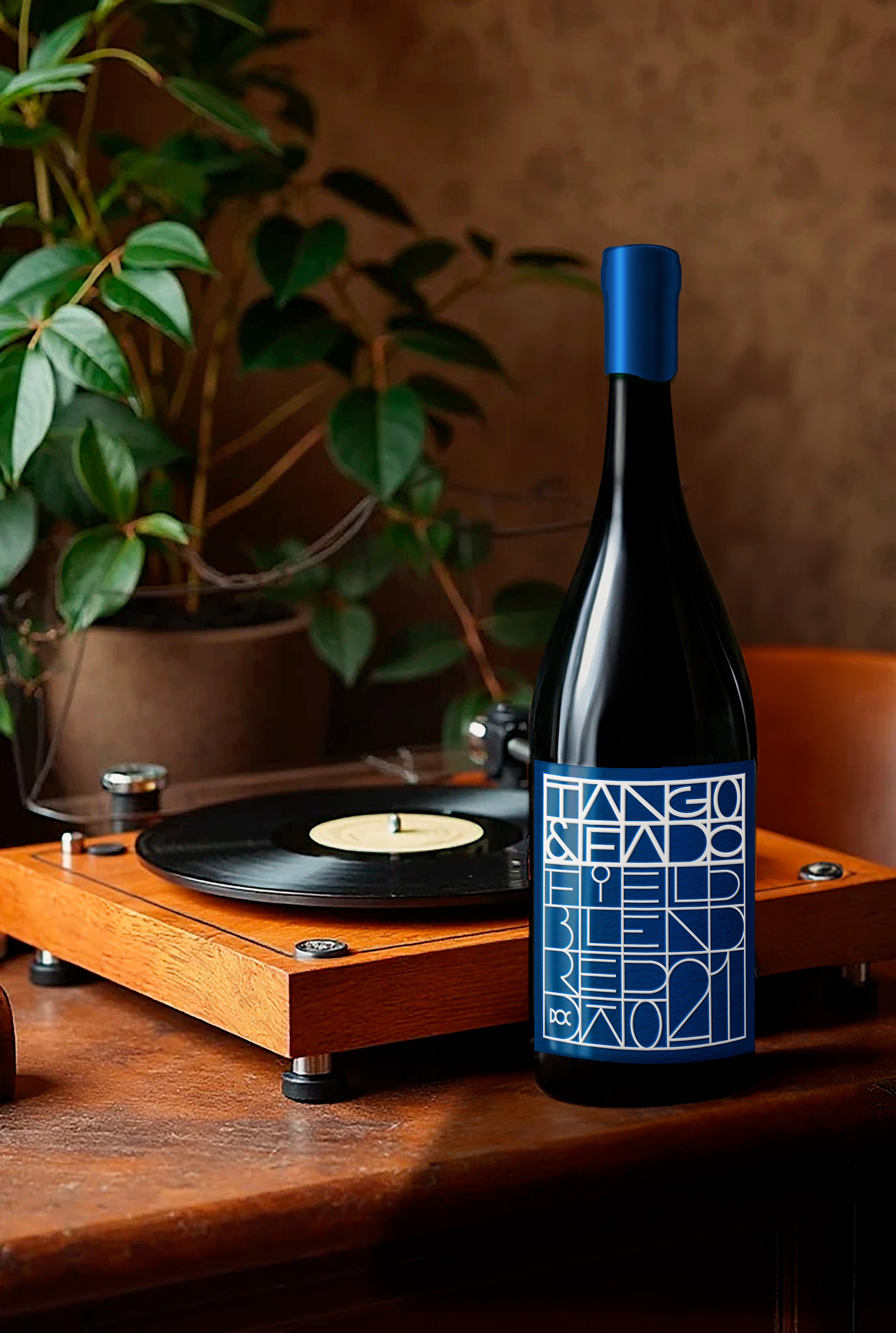
Every now and then a project comes along which ticks all the boxes. Illustration, packaging, complete identity, the lot.
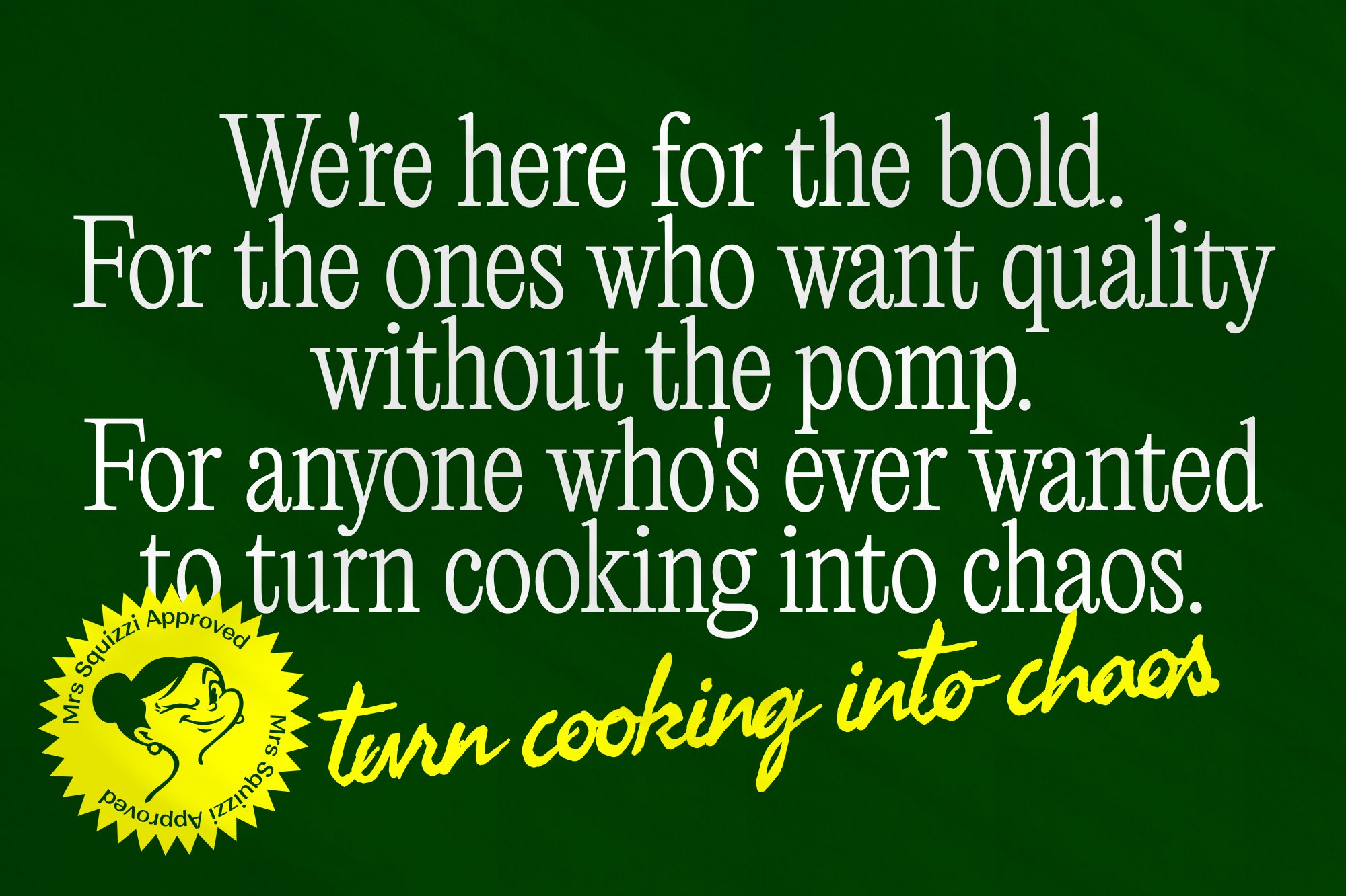
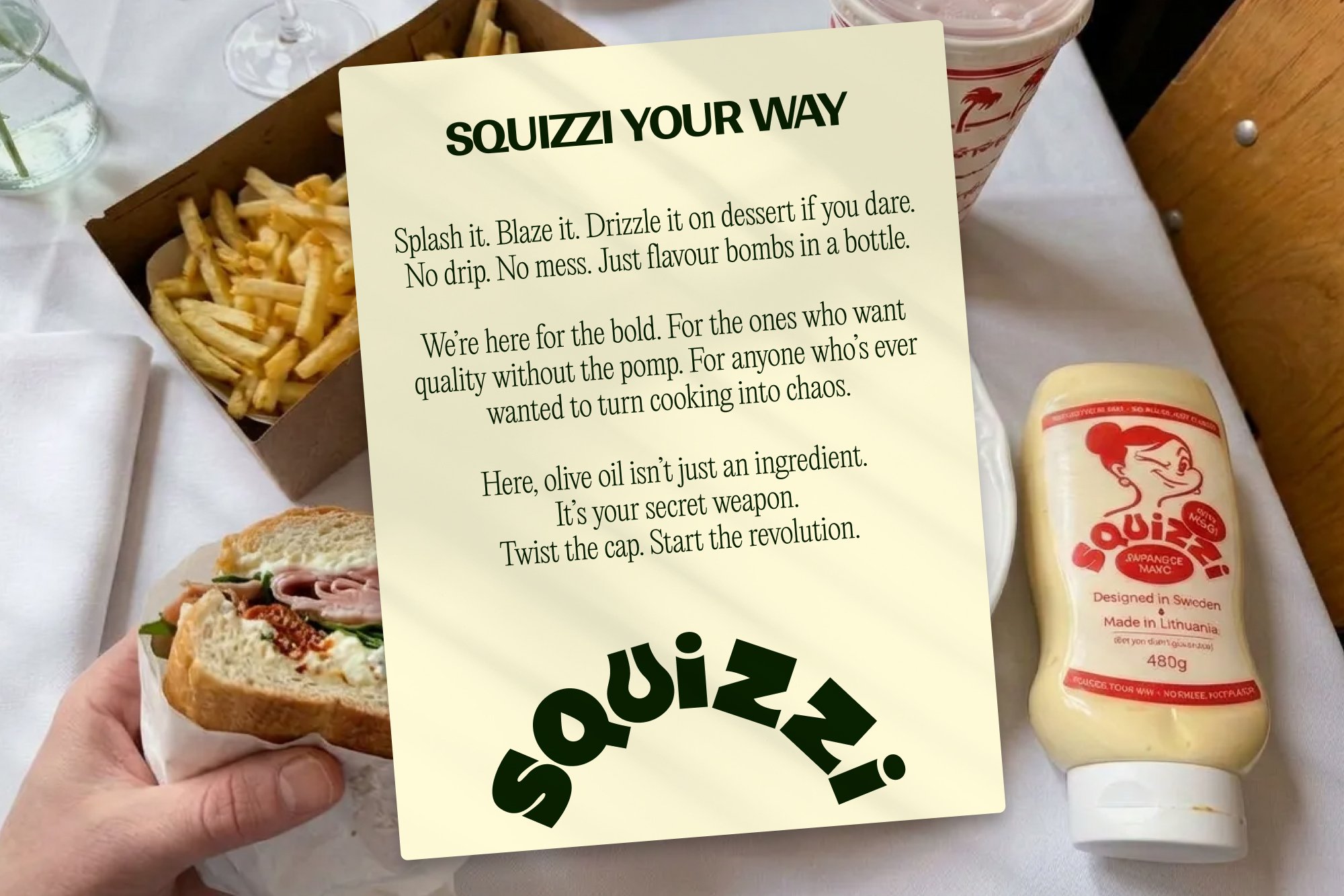
Philip and Edward, the founders, came together out of a shared love of good food and a frustration at how hard it was to find proper olive oil in Europe. They wanted to create something unapologetically good — honest, vibrant, and distinctly not another “artisan” cliché.
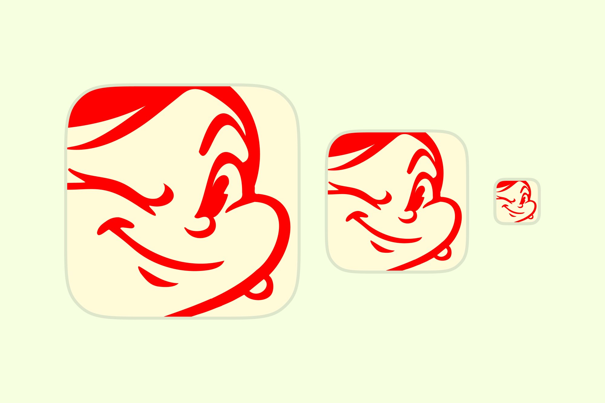
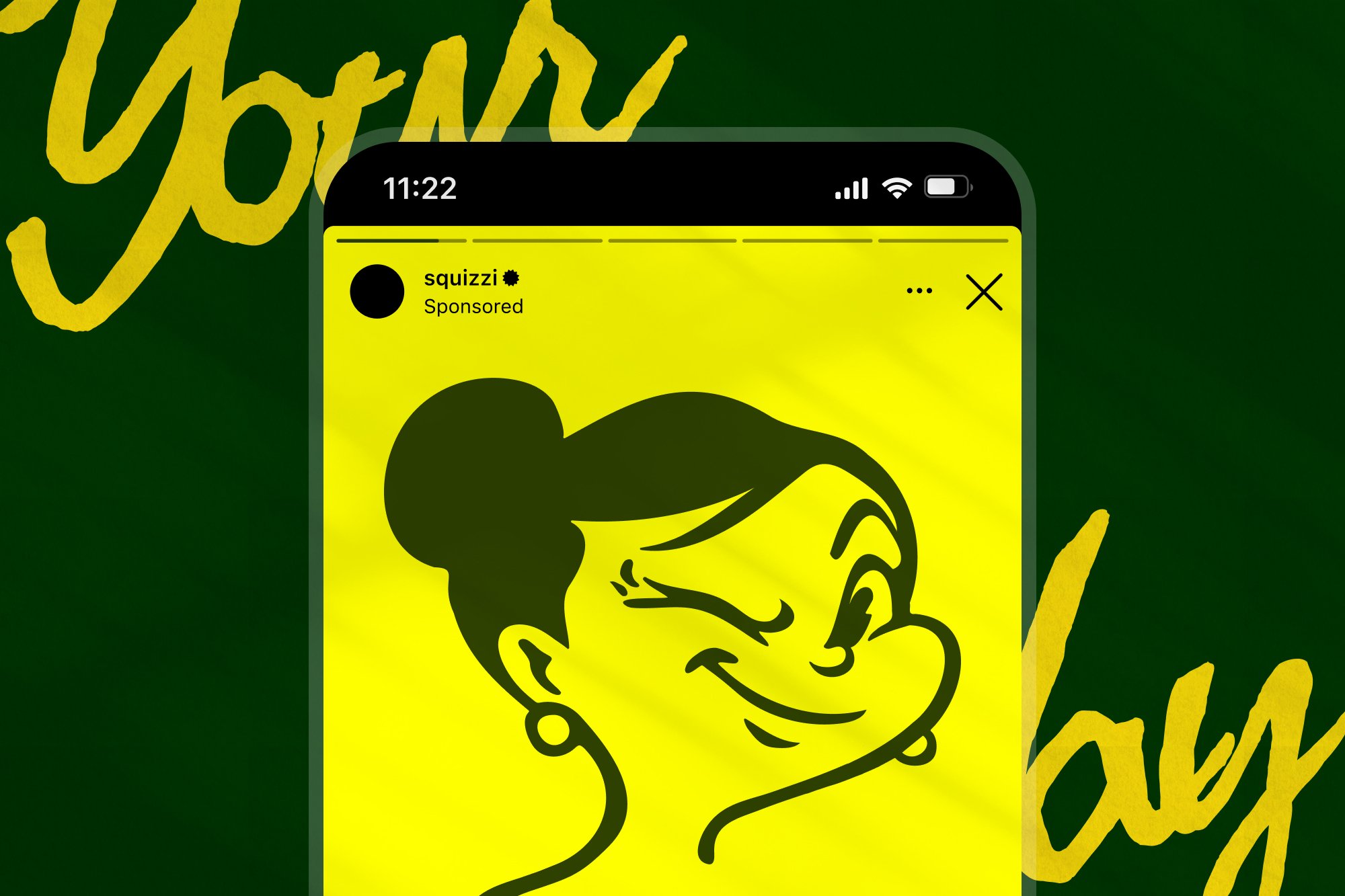
From the start, it was clear this wouldn’t be a minimal, beige brand. It needed life, flavour, and a bit of mischief. Originally I was inspired by the Popeye character Olive Oyl — her name, her spirit, that cheeky wink.
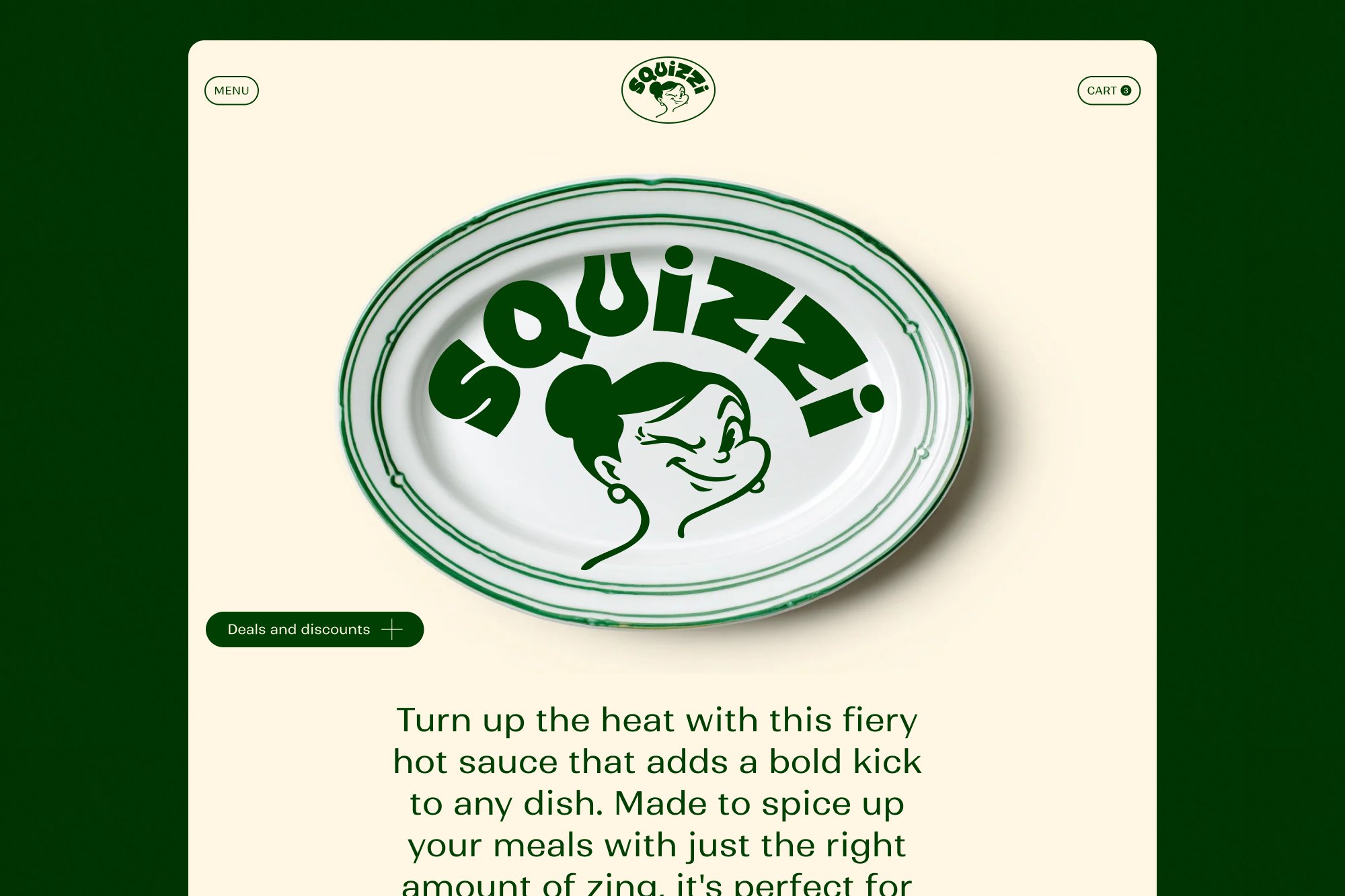
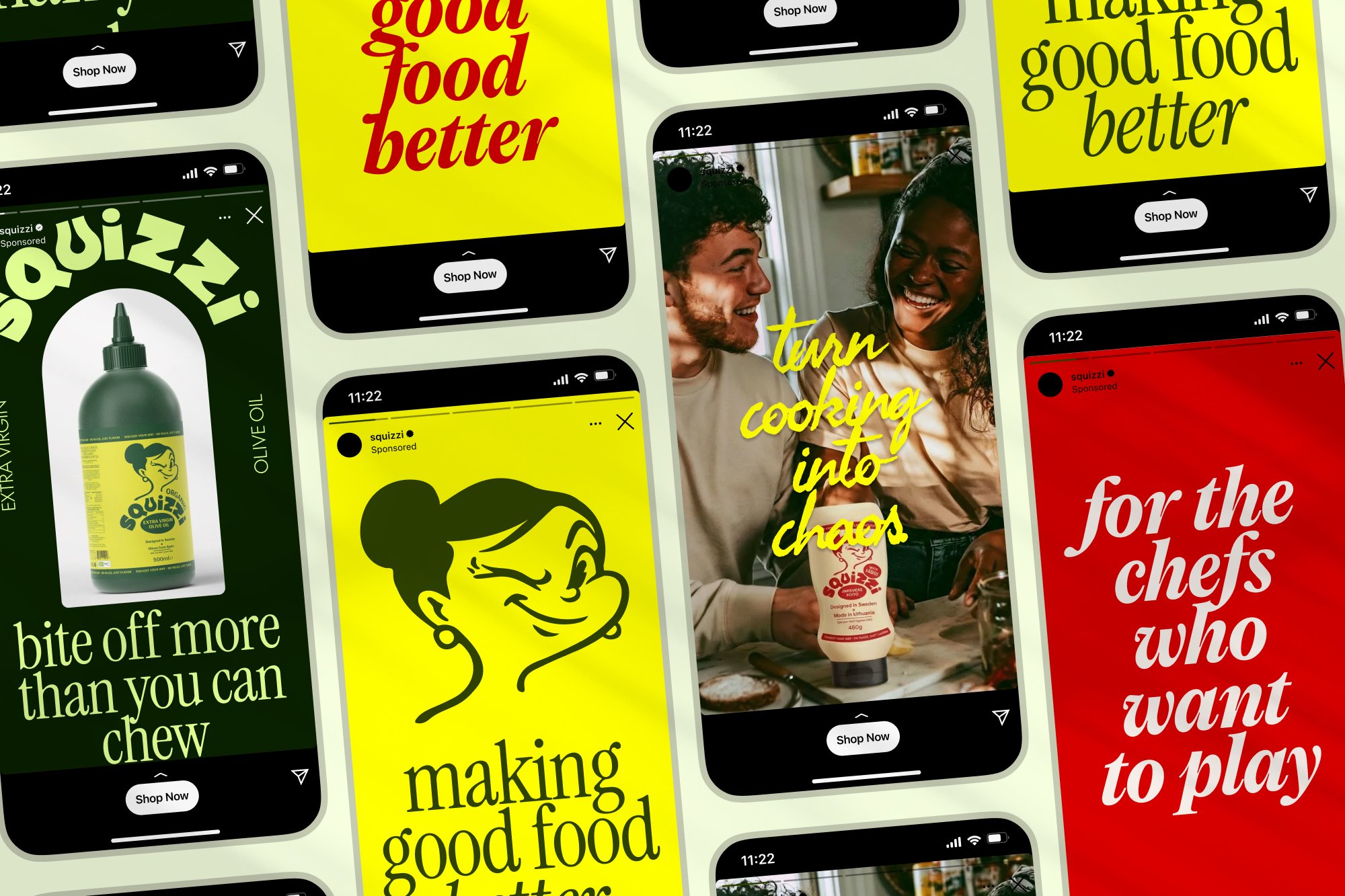
Mrs Squizzi is rebellious, cheeky, bold and playful. She symbolises the brand, having fun while cooking, regardless and in spite of the mess.
Building a heroine from scratch
As the brand began to lean beyond olive oil, and after a few conversations with friends Lauren and Dani about the grey area of public domain use, I decided to create a character from scratch. I don’t like legal grey zones — and by that point, it was clear Squizzi was becoming more than just olive oil. The brand needed its own world, its own heroine.
Mrs Squizzi was born. Playful, rebellious, and a little unpredictable. She embodied the brand’s energy perfectly. The illustrations, packaging and tone all grew from her attitude: bold colours, sharp lines, and a confident wink that invites you in.
The result was a brand that feels alive — Italian at heart, but created in Sweden, and unmistakably itself.


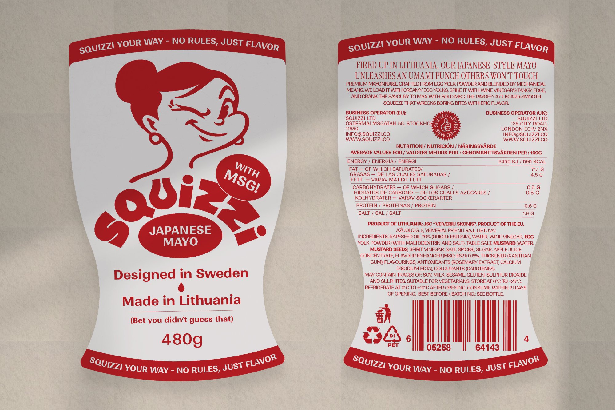
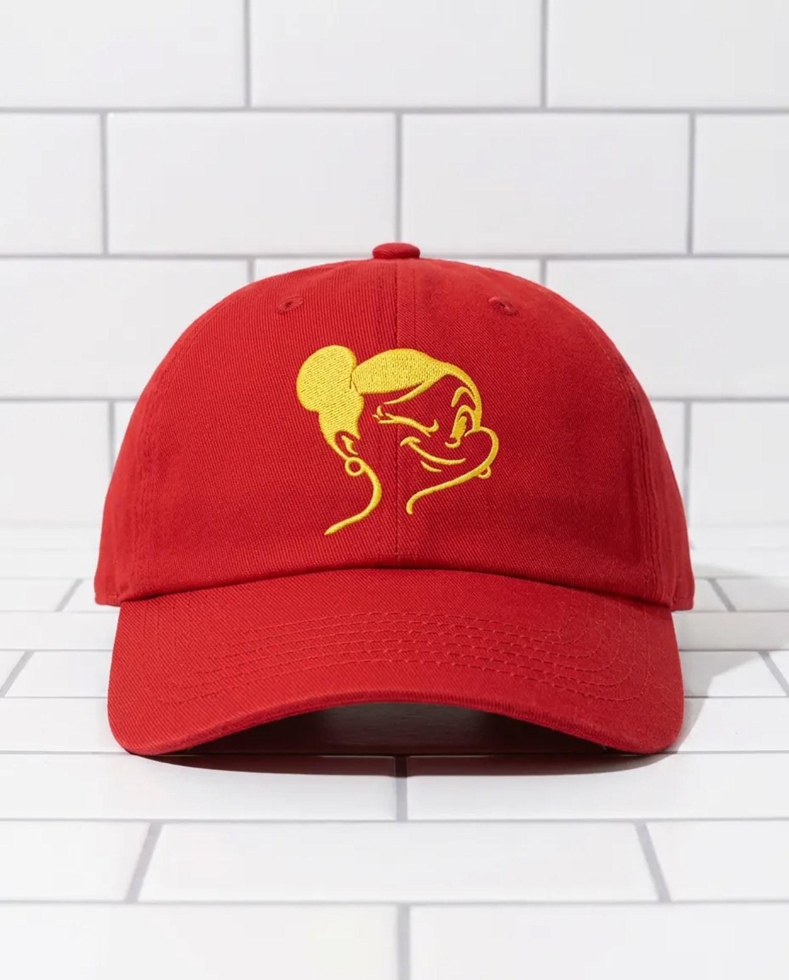
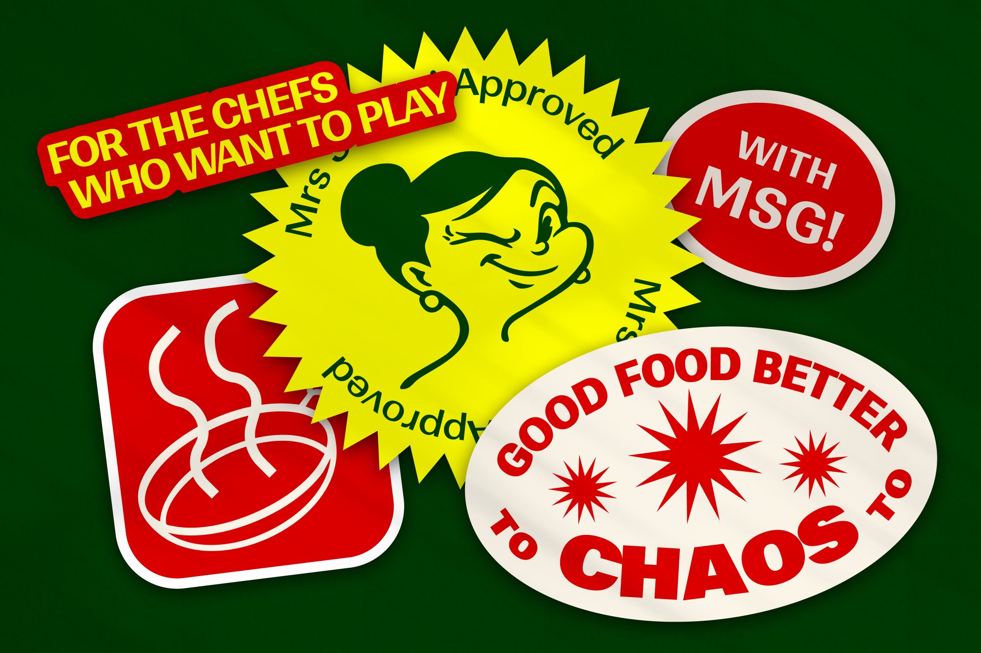
Mrs Squizzi is rebellious, cheeky, bold and playful. She symbolises the brand, having fun while cooking, regardless and in spite of the mess.